
The Trackless brand
Rules for the correct use of the logo, colours and graphic elements of the Trackless brand - cookieless analytics for online stores. Consistent use builds trust.
Track less. Get more.
Trackless measures store performance without its own analytics cookies and without tracking individual people - less tracking, more insight. The visual style is therefore clean, matter-of-fact and confident: plenty of white space, sharp typography and a single bold blue accent. No clutter, no tricks - just like the product.



Logo variants
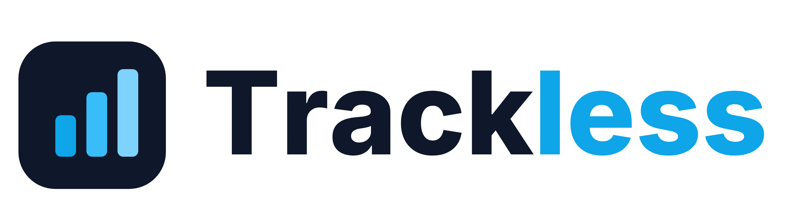
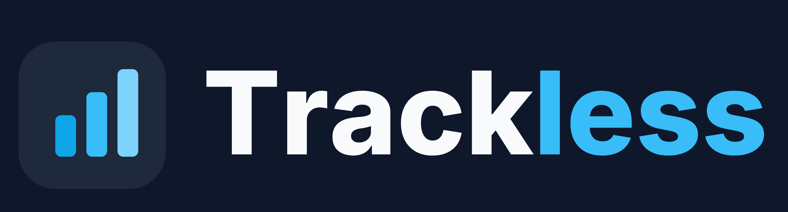
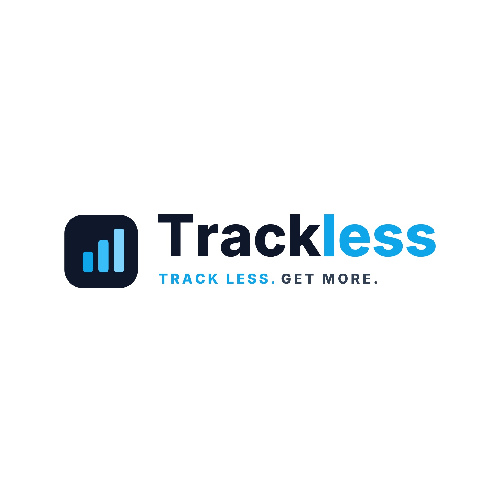
The logo is made up of the mark (a rounded square with three rising bars) and the wordmark “Trackless”. The primary version is the full one with the claim. Always use the supplied files - never redraw the logo.
Monochrome versions
For single-colour printing, stamps, invoices, engraving or low-contrast backgrounds. Use the one with sufficient contrast against the background.



Let the logo breathe
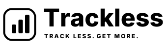
Keep clear space around the logo of at least ½ the height of the mark (shown in blue). No text, image or edge may enter this zone. More space = better.
Minimum size
Do not scale the logo below these sizes, or it loses legibility.
Full logomin. 120 px / 32 mm wide
Symbolmin. 24 px
Brand colours
The identity rests on two main colours - dark Ink and blue Sky. Complementary shades of blue form the bars motif, greys serve text and lines. CMYK is for guidance; fine-tune for print to your profile.
Main
Wordmark, brand tile, body text, dark areas.
Accent, “less” in the logo, links, buttons, highlights.
Complementary
Middle bar, secondary accent.
Tallest bar, light areas.
Brand tile on a dark background.
“GET MORE.” in the claim, darker text.
Secondary and descriptive text.
Lines, borders, dividers.
Light background for sections and cards.
Main background, negative space.
Typeface
The wordmark is set in a geometric sans-serif in bold and converted to outlines - so it is never reproduced by retyping, always from a file.
abcdefghijklmnopqrstuvwxyz 0123456789
Geometric grotesque, bold weight. The word “Track” in Ink, “less” in Sky.
Stack: system-ui, -apple-system, "Segoe UI", Roboto, sans-serif. Recommended substitute for printed materials: Inter or Poppins.
The rising bars motif
The three rising bars from the mark are a standalone graphic element - they symbolise growth and clear numbers. They can be used as an accent, a section divider or decoration, always in shades of Sky and sparingly.
Misuse
To keep the logo recognisable, do not alter it. Here are the most common mistakes.
Everything in one place
The complete package contains all logo variants (SVG, PNG, JPG), favicons and this manual in PDF.
| Asset | Use | Formats |
|---|---|---|
| Logo - primary | Light background | SVG · PNG · JPG |
| Logo - on dark | Dark background | SVG · PNG · JPG |
| Logo - compact (light) | Headers on a light background | SVG · PNG |
| Logo - compact (dark) | Headers on a dark background | SVG · PNG · JPG |
| Logo - black | Monochrome, light background | SVG · PNG |
| Logo - white | Monochrome, dark background | SVG · PNG |
| Symbol / app icon | Avatar, tile, square | SVG · PNG · JPG |
| Favicons | Browser, mobile, PWA | 32 · 180 · 192 · 512 |
| OG image | Preview when sharing a link | PNG |